How to Blend Textures and Tones With Your Granite Countertop
Designing a beautiful kitchen requires a delicate balance of colors, materials, and light. Choosing a natural stone surface is a lasting investment in functionality and style. Your granite countertop serves as the visual anchor of the room, setting the stage for every other design decision you make. Because stone brings its own unique character to the space, building a cohesive palette around it can sometimes feel daunting. However, understanding how to pair the subtle nuances of the stone with complementary elements will instantly elevate your home.
The key to a layered kitchen lies in recognizing that a room should never feel flat. You want a dynamic and inviting space, which means paying close attention to both visual warmth and physical feel. By thoughtfully combining different finishes, you prevent the space from looking overly sterile or busy. Whether you're updating an existing layout or starting a renovation from scratch, strategic choices will help you bridge the gap between hard surfaces and soft surroundings. Let us explore the best strategies for achieving this harmony.
Identify the Natural Undertones in Your Granite Slab
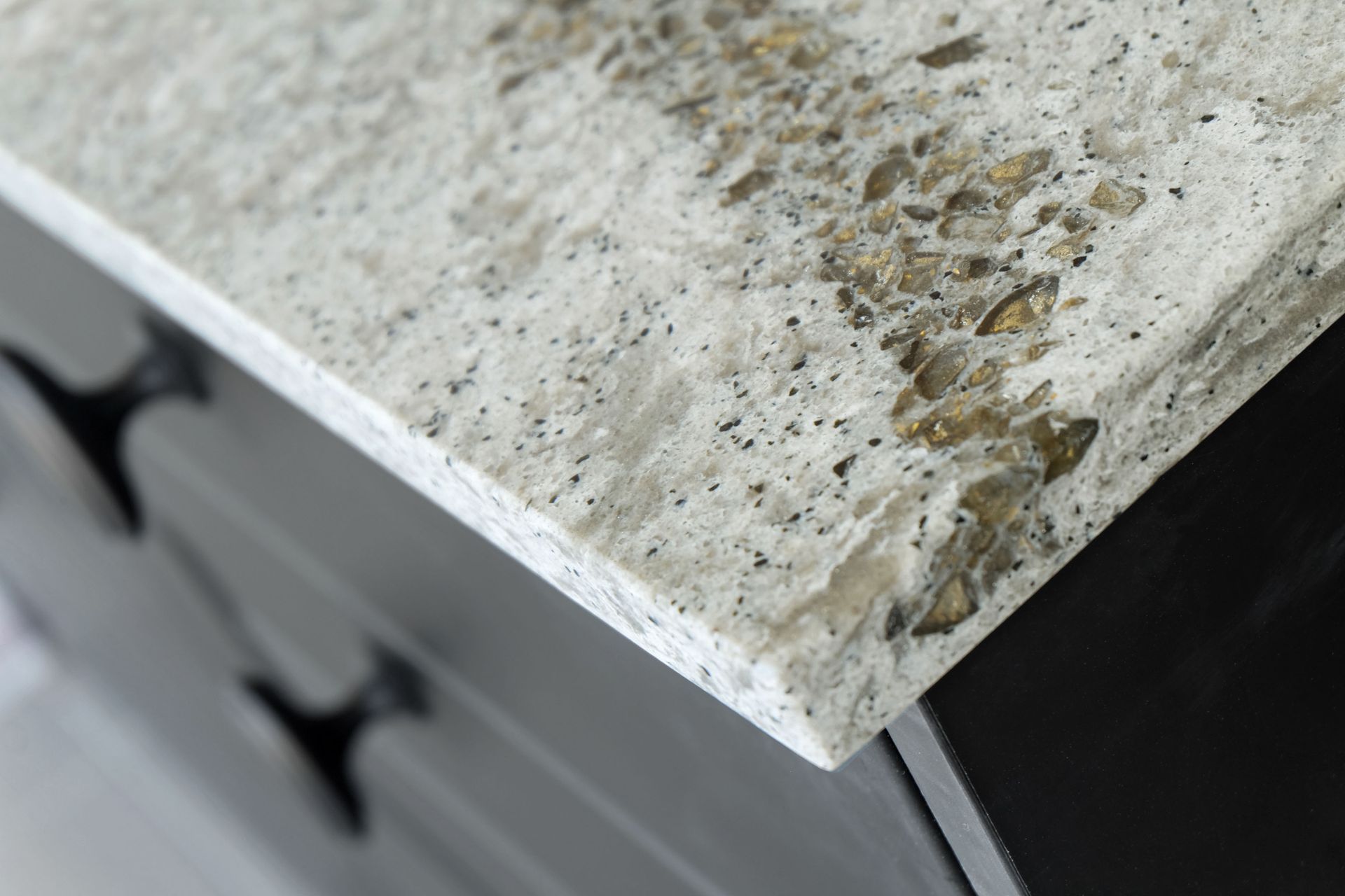
Before you make any design decisions, take a close look at the subtle undertones within your granite countertop. While the main color might appear obvious at first glance, granite often contains flecks or veins of secondary hues such as warm golds, cool grays, soft blues, or even hints of green. These undertones play a major role in determining how the stone pairs with other elements in your kitchen.
Start by observing your slab in different lighting conditions. Natural daylight and indoor lighting can bring out different tones, which may influence how your cabinets or backsplash appear alongside it. If you notice warm undertones, you may want to lean into creamy whites, beige cabinetry, or wood finishes. If your slab has cooler tones, crisp whites, charcoal shades, or stainless accents may feel more cohesive.
It also helps to understand what gives granite its visual complexity. According to Britannica, the main mineral in granite is feldspar, with the two most common types being plagioclase feldspar and alkali feldspar. These minerals contribute to the variation in color and pattern that makes each slab unique. By identifying these natural variations, you can make more informed decisions about how to coordinate surrounding materials.
Once you have a clear sense of your slab’s undertones, use them as a guide rather than competing against them. Pulling even one subtle color from the stone into your cabinetry, wall color, or decor can tie the entire space together in a natural and understated way.
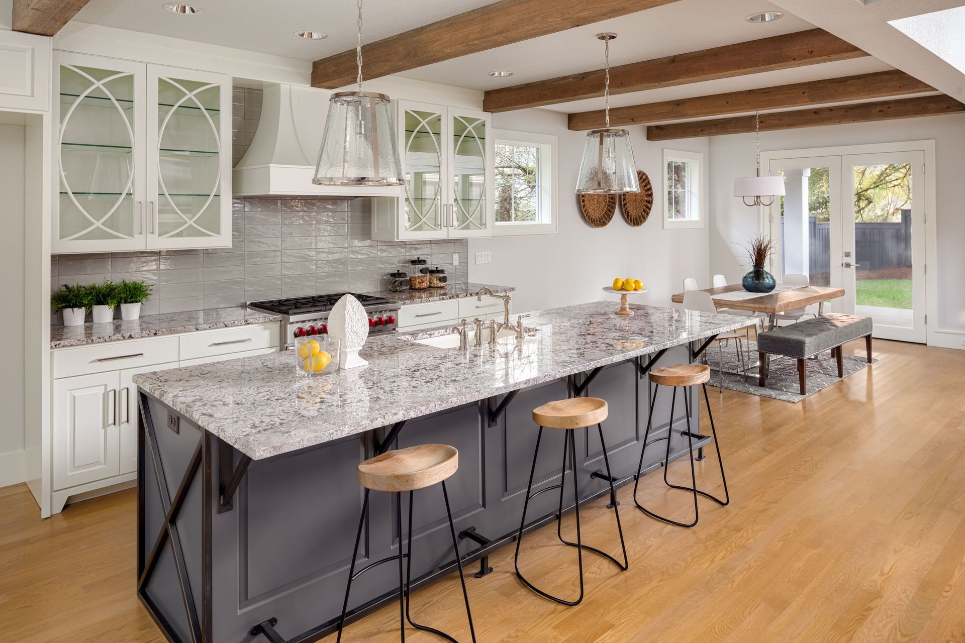
Balance Polished Surfaces With Tactile Textures
A polished granite countertop brings a sleek and reflective quality to your kitchen, which can elevate the overall look. However, if every surface in the space feels smooth and glossy, the design can start to feel flat or overly uniform. That’s why introducing tactile textures is key to creating balance and visual interest.
Consider pairing your polished stone with materials that have a more natural or matte finish. Wood cabinetry with visible grain, textured tile backsplashes, or even woven bar stools can soften the look and make the space feel more inviting. These elements add depth without distracting from the beauty of the granite itself.
Layering textures also helps define different areas within your kitchen. For example, a smooth countertop paired with a slightly rough backsplash can create a subtle contrast that draws attention without overwhelming the space. This approach works especially well in open concept kitchens where visual variety keeps the design engaging.
You don’t need to go overboard with texture to achieve this effect. Even small details like brushed finishes on fixtures or lightly textured wall paint can make a noticeable difference. The goal is to create a mix that feels intentional and comfortable rather than overly styled.
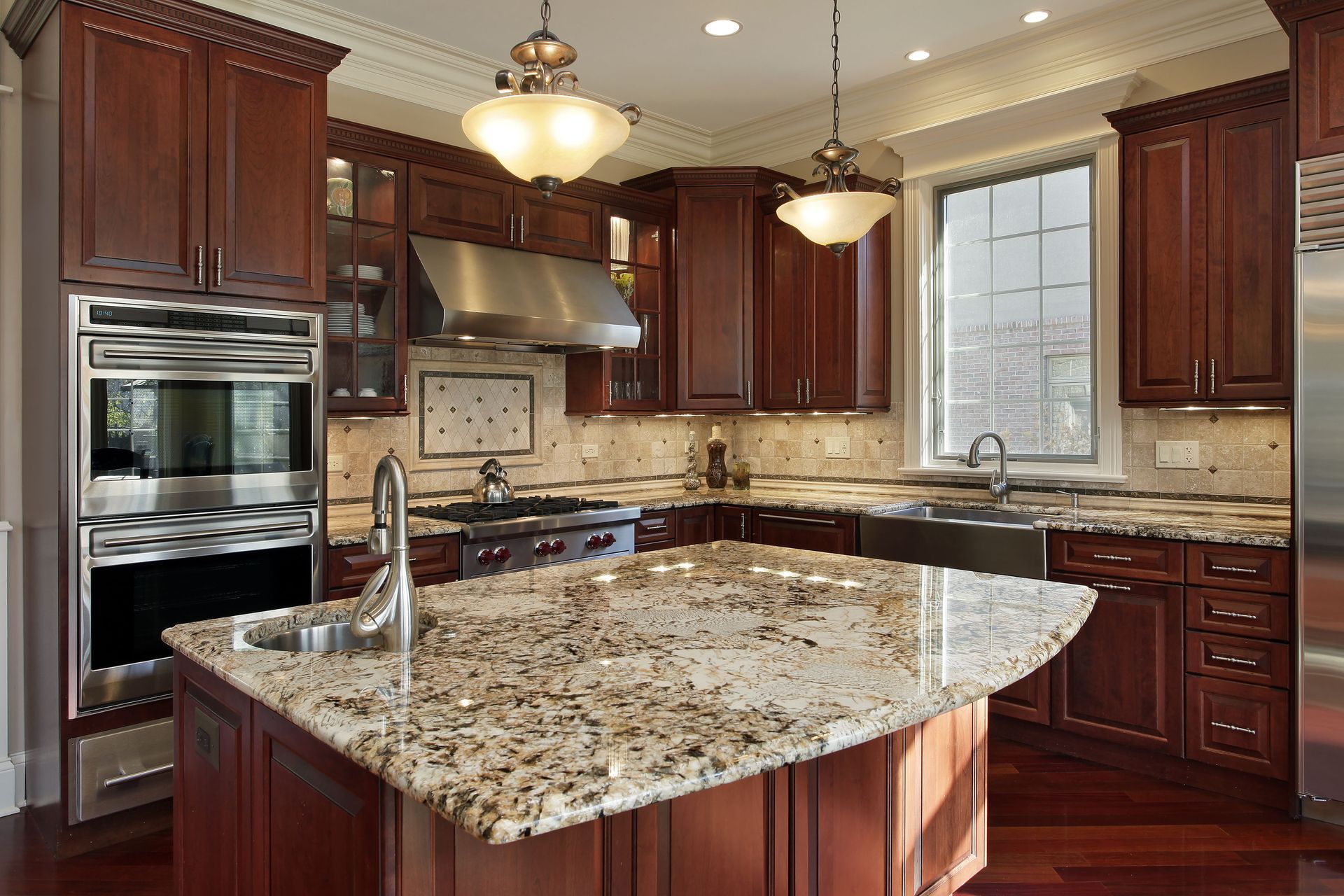
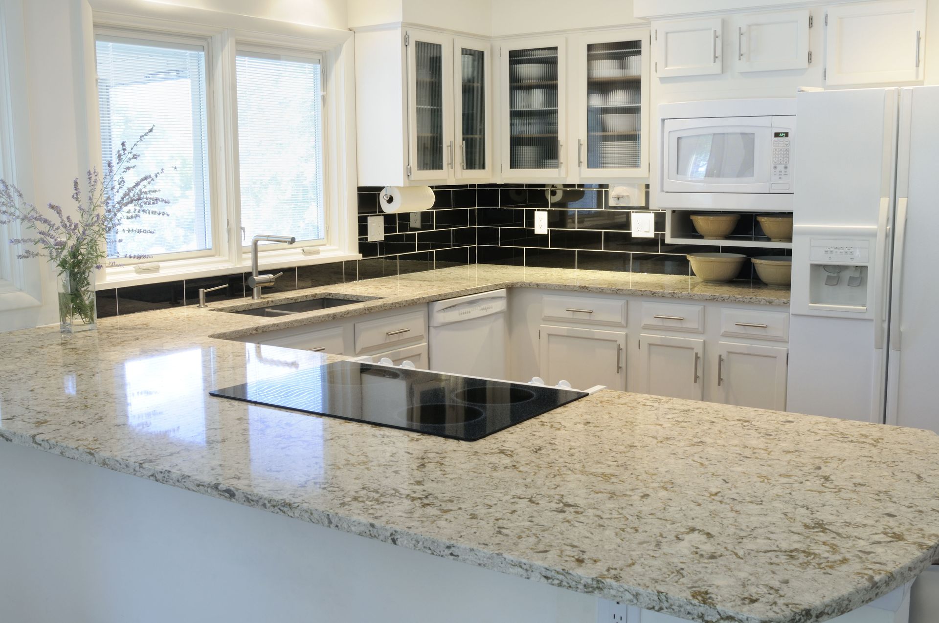
Create Contrast Between Countertops and Cabinetry
One of the most effective ways to highlight your granite countertop is by creating contrast with your cabinetry. When the colors are too similar, the design can feel washed out and lack definition. On the other hand, a thoughtful contrast can make both elements stand out while still working together harmoniously.
If your granite features darker tones, consider lighter cabinetry to create a clean and balanced look. White, cream, or light gray cabinets can brighten the space and allow the stone’s pattern to take center stage. If your countertop leans lighter, darker cabinets in shades like navy, espresso, or charcoal can add depth and sophistication.
Contrast doesn’t always have to be dramatic to be effective. Even a subtle shift in tone can create enough distinction to keep the design interesting. For instance, pairing a warm beige countertop with slightly deeper taupe cabinets can provide a layered look that feels cohesive without being monotone.
Keep in mind that contrast should still feel connected. Look for shared undertones between your cabinets and counters so the pairing feels intentional rather than mismatched. This balance allows each element to stand out while contributing to a unified overall design.
Harmonize Stone Finishes With Kitchen Hardware
Your kitchen hardware might seem like a small detail, but it plays a significant role in tying your design together. The finish and style of your handles, faucets, and fixtures should complement the look and feel of your granite countertop rather than compete with it.
Start by considering the overall tone of your space. Warmer granite slabs often pair well with finishes like brushed brass or oil-rubbed bronze, which enhance the cozy feel of the kitchen. Cooler-toned granite tends to look best with chrome, polished nickel, or matte black hardware that reinforces a clean and modern aesthetic.
Texture also matters when choosing hardware. If your countertop has a glossy finish, opting for brushed or matte hardware can create a pleasing contrast. This subtle variation prevents the space from feeling too uniform while still maintaining a cohesive look.
Consistency is key when you're deciding on hardware finishes. Mixing too many metals or styles can make the design feel disjointed. Instead, choose one primary finish and carry it throughout the space. This approach helps your counters feel integrated into the overall design rather than standing apart from it.
Blending textures and tones in your kitchen doesn’t have to feel complicated when you take a thoughtful approach. By starting with the natural characteristics of your granite countertop, you can build a design that feels cohesive from the ground up. Your stone surface is a product of nature, bringing a distinct personality and a specific set of colors to the table. Paying attention to undertones, finishes, and complementary materials helps ensure that every element works together rather than competing for attention.
As you make design decisions, remember that balance is key. You don't need to match every single element perfectly to achieve a wonderful design. Combining smooth and textured surfaces, creating contrast where needed, and coordinating finishes can transform your kitchen into a space that feels both functional and visually appealing. With the right approach, your countertop becomes more than just a surface: it becomes the centerpiece that ties your entire kitchen together.
Are you ready to transform your kitchen with a beautifully blended granite countertop? Contact the experts at Stone Craft LLC today, and we'll help you design the cohesive space you've always wanted.
Share On: